
Insights, heat map, and health score
Three pages that help you read your data, not just record it.
Spending Insights
Section titled “Spending Insights”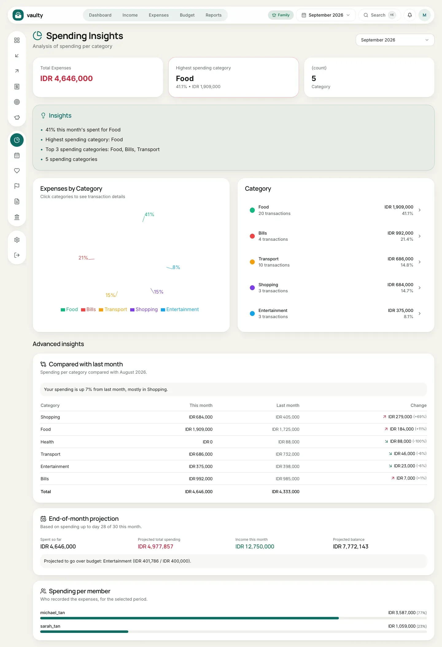
This page shows your spending per category for the selected month: a pie chart, a ranking of categories, and a few automatic insight sentences. Click a category to see its transactions. Available on every plan.
Advanced insights (Family plan)
Section titled “Advanced insights (Family plan)”At the bottom of the page, the Family plan adds three analyses:
- Compared with last month: a per-category table (this month, last month, the change and its percentage) with a summary such as “your spending is up 40%, mostly in Food”.
- End-of-month projection: an estimate of total spending by month end based on the pace so far, compared with income, plus a list of budgeted categories projected to go over their limit. The projection only applies to the current month and appears after at least 5 days of data.
- Spending per member: who recorded how much, useful for families.
Other plans see an upgrade hint here.
Expense Heat Map (Personal and above)
Section titled “Expense Heat Map (Personal and above)”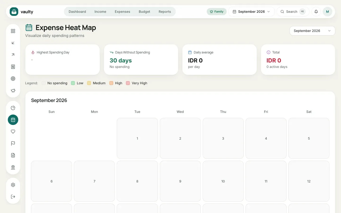
The heat map shows the days and times you spend the most. A darker color means higher spending. It helps you spot habits, such as overspending on weekends.
Financial Health Score (Personal and above)
Section titled “Financial Health Score (Personal and above)”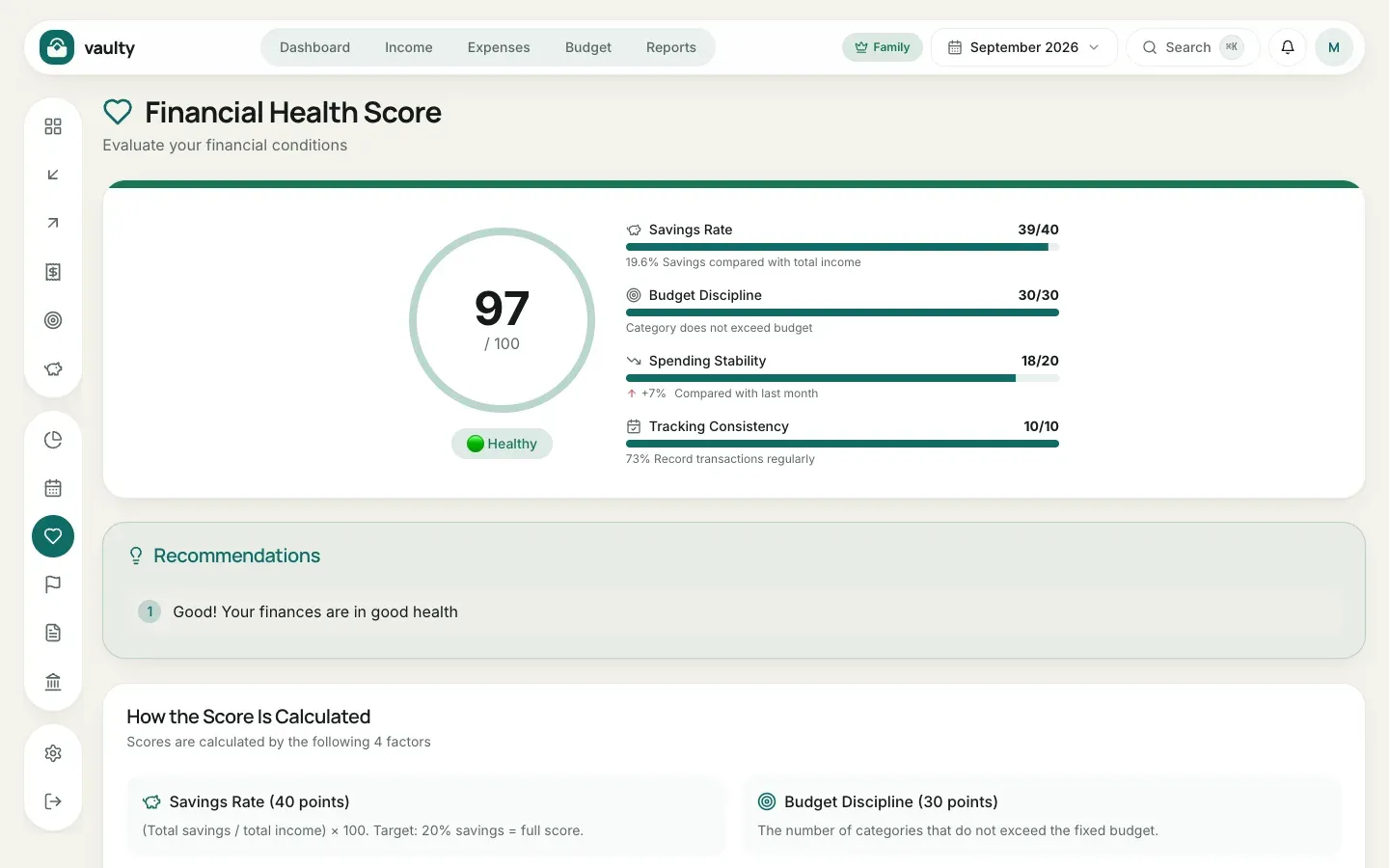
A score from 0 to 100 built from four components:
| Component | Weight | What it measures |
|---|---|---|
| Savings Rate | 40 | savings compared with income (target 20%) |
| Budget Discipline | 30 | categories that stay within their budget |
| Spending Stability | 20 | how spending changed from last month |
| Tracking Consistency | 10 | how regularly you record transactions |
Below the score are Recommendations pointing to what to improve first.